Websites are stealing my content! What should I do?!

Often, bloggers are faced with the harsh reality that at some point, their website’s content is going to be copied (or stolen) by one or more websites. Not only can this hurt you emotionally, given the amount of time you probably spent writing a quality piece, but it can severely hurt your website as a whole. As anyone with basic web knowledge knows, search engine ranking is the game of the day. Without a good rank, your site is considered dead.

Why?

The reasons behind why other webmasters steal content can vary from person to person, but generally, these are the top three:

  • Domain rank – Whether you knew it or not, the words used to make up your domain name are considered in your search ranking. An example of this is if you write a blog all about your favorite comic books, but your domain doesn’t mention anything about comics at all. This can cause another site, like myfavoritecomics.com to be ranked higher even if they’re content isn’t that great. How this translates into stealing content is simple: a webmaster goes and finds a domain name that better describes your content and then copies everything you have onto their new site. If they get their way, they will soon outrank you.
  • Autoblogging – This practice is more common than not. If a webmaster wanted to create a new site relatively fast and begin competing for search rank, all they would need to do is start an autoblogging service that scours the web looking for content based on keywords they input and off they go. Your content is copied and placed on their new site. I strongly discourage using these practices because they don’t enhance the web experience in any way, but if you’d like to read more about autoblogging, you should do so at your own risk!
  • Higher search rank – Naturally, the main reason for stealing content is to increase your web presence, however they’re doing so at your expense. If you operate a site that only gets crawled once a day and another site gets crawled every hour, then it becomes very possible for the other site to steal your content before Google even knows you had it. At this point, Google now ranks the other site higher and your site looks like the copycat!

So what can you do about this? The short answer is nothing much. The laws of the Internet (and computers in general) dictate that any content found online can be copied and everyone can access it. It’s the inherent downside to such a cool piece of technology. However, all is not lost! Your goal should be to protect your content as much as possible and one major way to do this is to update your site frequently. If you become one of those sites that gets crawled every hour, then you won’t have to worry about looking like a copycat.

Reporting illegal activities

In case you didn’t know, Google offers a way in which you can report content thieves and other spammers. Here are some tips on how to do that:

  • Remove content from Google – Use Google’s own form available at google.com/dmca.html to file a report against any content you find online that may be violating your copyright(s). With this tool, you can also report unlawful content and defamation/libel content.
  • Visit Dmca.comDmca.com provides services regarding all sorts of copyright infringements including watermarking photos and filing takedown requests for serious violators. These services aren’t free, but if you’re providing very valuable information, you should consider how valuable it is in regards to your Google standings.
  • Contact violators – The old fashioned way of confronting your attacker! I’ve had luck with contacting webmasters directly and asking them to take down copyright-infringed content and surprisingly had more luck with them actually removing content. This approach can help new webmasters understand the “laws of the land” as well as give them a sporting chance to better themselves.

Running a website can be hard and some of us put a lot of our free time into our publications. There’s nothing more dis-heartening than finding out that someone else may be reaping benefits from something you created. I now know how musicians feel as they watch all of their music being freely distributed throughout the world!

More information

Review the provisions outlined in the Digital Millennium Copyright Act to become more proficient in dealing with copyright claims. You should also out everyone who uses the Internet by filing reports against spam-filled websites. Google doesn’t want junk sites in their indexes, so let’s all help them out by getting them removed!

You can also view my copyright information regarding this site to help you with creating your own set of rules for visitors who use your site.

Visual Design – CDN

CDN stands for Content Delivery Network. Its sole purpose is to help you evenly spread your entire website’s content (mostly the larger media files) across multiple web servers to alleviate server load from a single machine. This, in turn serves two purposes.

First, it minimizes how much bandwidth you’re serving out to your web visitors on your webhost. Second, it allows your site to run smoothly without server crashes, timeouts and user caps. However, a CDN can be quite expensive depending on what type of CDN you require and what services you need. Let’s explore these.

CDN Types

A Content Delivery Network can serve the function of completely mirroring a portion of your site or a specific area of your site, like your video section or streaming music channel. Back in the old days, we didn’t have sites like YouTube, so if you wanted to play videos on your site, you needed a lot of bandwidth or pay a company to host the video for you and stream it live from your site.

  • End-to-end Transport – This is the fundamental standard of the Internet. It basically means the service will connect you to the content directly. Let’s say you had 10 videos all about 5 minutes each. Just for the sake of this point, let’s assume to stream each video, it would “cost” you about 100mb in bandwidth. If your site streamed all 10 videos 10 times a day, that’s 10GBs of bandwidth every day! To offset this cost, a CDN would charge you a monthly fee to host the video thus sparing your server–and your wallet.
  • P2P Transport – I can write a whole article on just P2P alone! To keep this one short, P2P is short for peer-to-peer and it is currently used as the backbone for downloading content online. The idea behind it is sharing. For example, when you are downloading (and watching) a video, you are also helping in the upload process for someone else who is watching it too. So rather than 1000 people streaming 1 video from 1 site, each of these thousand are sharing the parts they downloaded with the other users who need them. This allows the 1 video to circulate through all viewers at the same time thus removing the main load from the website.

CDNs aren’t generally described as P2P networks as they were designed to use point-to-point protocol, however P2P has become a fast alternative and popular protocol among the large media sites of today. Some examples of CDNs (and P2P) are bit torrent, Internet radio, Hulu, YouTube, Webcasting and Internet tv.

Content Providers

High-end delivery companies are designed to handle massive amounts of web users, traffic and media data every single day. If you’re running a basic website or blog, you will never need something of this nature, but nonetheless, here are a few commercial companies.

How does all this help me?

Again, depending on your specific needs, you may or may not even need a CDN. The point is that if you have a very large web presence, you might want to consider saving some of your webserver’s bandwidth and going with a company that specializes in these services. Doing so can dramatically decrease your monthly costs and save you a lot of headaches over time.

<< Back to Bandwidth Consideration Forward to Interlaced Images >>

iPhone 4 Lands June 24th, 2010

I tell you, the last few months have been crazy over this new device! First of all, we caught a glimpse into the world of Apple when a man by the name of Gray Powell left a prototype device at a bar in Redwood City after celebrating his birthday. Shortly after he left the bar, someone found the device and sold it to Gizmodo who then explored the device to it’s fullest to get a clearer idea of what it was.

Gizmodo broke the story about the iPhone 4 to the world, thus causing Apple to sue for theft and have the editor who wrote the article turn over his property to the cops for evidence.

Once the phone was finally claimed by Apple and then officially announced, all we wanted to know was “how much?” and “when can we buy?”. Not only did the phone itself cause the demand to be exceptionally high, but the announcement of AT&T allowing early upgrades for basically any contract that would be expiring in 2010 opened to flood gates to just about every single previous iPhone owner.

Black Tuesday

June 15th was the day selected for the pre-ordering of iPhone 4 and boy what a day it was! Here are a few of the things that went down (pun intended) that day:

  • iPhone 4 Pre-order system shuts down – The pre-order system was opened at about 1am on June 15th and right from the start, people were complaining about not being able to get in the system to place an order.
  • AT&T account security breaches – Many AT&T users (including me) experienced a wide-spread security breach within AT&T after logging into their wireless accounts online. Instead of seeing their own information, they were presented with the information of someone completely different.
  • AT&T stores took iPhone pre-orders on paper – Many customers (including me) were forced to have a pre-order written down on paper only to be processed later.
  • iPhone 4 orders were being randomly cancelled – It almost seemed completely random, but iPhone 4 orders were getting cancelled left and right with no apparent reasoning behind it. I think it had to do with people placing multiple orders on single accounts or the old rule about upgrading your account where you actually couldn’t upgrade if you had a balance due. I made sure I paid my bill before I started this process!!
  • Shipping date for iPhone pre-orders pushed to July – It appears like July 14th is the earliest date you can expect your iPhone to ship. The demand was just too much for AT&T and Apple to handle.
  • Best Buy was pre-ordering white iPhone 4s – Somehow, a few people were able to successfully order a white iPhone 4 from Best Buy even though it was clearly stated that the white iPhone 4 would not be available at launch date. We’ll see about the “successfulness” on June 24th!

The Aftermath

After all this, AT&T and Apple have both formally apologized. Apple released this statement:

CUPERTINO, Calif., June 16 — Yesterday Apple and its carrier partners took pre-orders for more than 600,000 of Apple’s new iPhone 4. It was the largest number of pre-orders Apple has ever taken in a single day and was far higher than we anticipated, resulting in many order and approval system malfunctions. Many customers were turned away or abandoned the process in frustration. We apologize to everyone who encountered difficulties, and hope that they will try again or visit an Apple or carrier store once the iPhone 4 is in stock.

And AT&T had this to say:

DALLAS, June 16 — AT&T issued the following statement today:

IPhone 4 pre-order sales yesterday were 10-times higher than the first day of pre-ordering for the iPhone 3G S last year. Consumers are clearly excited about iPhone 4, AT&T’s more affordable data plans and our early upgrade pricing.

Given this unprecedented demand and our current expectations for our iPhone 4 inventory levels when the device is available June 24, we’re suspending pre-ordering today in order to fulfill the orders we’ve already received.

The availability of additional inventory will determine if we can resume taking pre-orders.

In addition to unprecedented pre-order sales, yesterday there were more than 13 million visits to AT&T’s website where customers can check to see if they are eligible to upgrade to a new phone; that number is about 3-times higher than the previous record for eligibility upgrade checks in one day.

We are working hard to bring iPhone 4 to as many of our customers as soon as possible.

After the aftermath

The dust appears to be settling and the lucky people who got orders in on the 15th or manual orders on the 16th (taken on the 15th) are starting to see shipping information in their AT&T accounts. The blogs are on fire with people talking about their own personal experiences and of course griping from people who aren’t getting theirs on day one.

I had my own streak of good luck turned bad and then turned good again. I started off with two orders for the same account and then I thought I was getting none. I was thinking I’d see my phone in mid-July, but then I got the good news that mine had shipped! You can read my whole story on my blog. The story is called ‘How I Almost Got Two iPhone 4s on Release Day‘.

UPDATE 6-23-10

I just wanted to share that I received my new iPhone 4 today and from what I’m hearing, I’m one of few that actually received the device today and even fewer received it yesterday. Here are my last pictures from my iPhone 3GS (which is now on sale on eBay) and the first ones of my new iPhone 4.

©2010 Brandon.me and Ledfrog.com

©2010 Brandon.me and Ledfrog.com

Visual Design – White Space

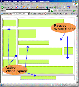
White space is the most literal concept you’ll find in this section. It is the actual space between design elements such as paragraphs, images, text, graphs, etc. The purpose of this space can vary depending on your desired results. One reason for using it might be to create a specific flow to your design. You may want to direct one’s eyes to something on a page more so than other items.

By the way, WebDesignNuts.com created a great article about how to use white space effectively, but to summarize, I’ve written a little piece myself.

Effective use of white space

The most common use of white space can be found in just about every publication on Earth including almost every website you’ve been to. What I’m referring to is the breakup of large blocks of text into smaller chunks that can be more easily digested. The following text is NOT effective use of whitespace:

We are guessing that most of you have already read Gizmodo’s account of how they managed to obtain a prototype for the upcoming Apple iPhone 4G device. If you have, then you’ll know that the whole thing was allegedly down to a 27 year old Apple Software Engineer, named as Gray Powell, who managed to leave the prototype in a bar in Redwood City, Calif. Now that the whole thing has come out, and Apple are yet to confirm or deny the story – what will the repercussions be for Mr Powell? Every human makes a mistake once in a while, but you have to say that this is a major blunder if it turns out to be true. Will Apple remove Powell from further duty, or will common sense prevail and no firm action will be taken? Hopefully it will be the latter, but you never know with Apple. Let us know your opinions on the whole saga and what YOU think should happen to Gray Powell.

-Text quoted from Product-Reviews.net

The text above looks much better if formatted properly:

We are guessing that most of you have already read Gizmodo’s account of how they managed to obtain a prototype for the upcoming Apple iPhone 4G device.

If you have, then you’ll know that the whole thing was allegedly down to a 27 year old Apple Software Engineer, named as Gray Powell, who managed to leave the prototype in a bar in Redwood City, Calif.

Now that the whole thing has come out, and Apple are yet to confirm or deny the story – what will the repercussions be for Mr Powell?

Every human makes a mistake once in a while, but you have to say that this is a major blunder if it turns out to be true. Will Apple remove Powell from further duty, or will common sense prevail and no firm action will be taken?

Hopefully it will be the latter, but you never know with Apple. Let us know your opinions on the whole saga and what YOU think should happen to Gray Powell.

-Text quoted from Product-Reviews.net

Now imagine if an entire website appeared like the first block of text! Just looking it would make you want to change the page. To make effective use of white space, you need to focus on things other than breaking paragraphs apart. Here are some things to consider:

  • Line spacing – In college, you generally had to make all your papers double-spaced, but on websites you can space as much as you like, even down to the last pixel.
  • Margins – Keep side bars and advertisements at bay so they don’t crowd your page too much. In general, you don’t want to flood your site with stuff like that anyway, but more importantly, you want to keep it away from your content. After all, you visitors don’t come to your site to look at ads.
  • Headings – Make sure your headings stand out and properly define the content below them. This isn’t just good practice for design, but also search engine rankings as well.
  • Images – How often have you been to a site where the images seem to be mixed right in over or under the text? Your images should standout alone and text should either wrap around them or stay on one side.

More information

This was just a sampling of what to look for when designing your pages. I’d suggest doing a deep search if you think you’re having problems adjusting content on your pages. If all else fails, get yourself a web template or theme that controls the layout for you.

<< Back to Layout Forward to Color Pallets >>

Visual Design – Layout

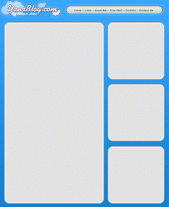
A crucial design element of your website is the layout. Believe it or not, there are phycological studies on the layouts of other media such as magazines and newspapers. Small, but important details including where certain text is, how big the titles of pages are and what colors are used are all attributed to the success or failure of a website.

The best way to get ideas for your own site’s layout is to look at other related websites that contain similar content and see what it is that you like and don’t like about it. What I do is look at a site for a few minutes, close my eyes and then try to remember the things that stood out.

Choosing the right layout

As you scour around the Internet, you may notice design patterns spanned over the various websites you see. You might have noticed that most news sites tend to favor white backgrounds with black text. You’ll notice media sites like YouTube and Hulu that design the rest of the site around their video players.

The point of any layout is to draw attention to a specific area of a page to generate the most focus on that spot. This will ensure that if you’re blogging, your content is being read or if you’re showing videos, that your videos are being watched.

Just take a look at my site. You can see how things are organized within a matter of seconds. Every page conforms to the same layout in general and this was done to keep everything looking clean as well as to allow the content to flow. When you create your own site, you want to make sure that the design flows and matches, but not to mix everything together. This can confuse your visitors and will probably make them leave your site.

Themes and templates

Both of these are generally the same. The difference is how they’re applied. A template is a set of pre-built files that make up a website that allows you to fill in or change information to correspond to your own needs. A theme does the same purpose, but it’s applied to a pre-built structure. The main difference between themes and templates is that you can change the theme of an entire website without affecting too much of the content. A template needs to be re-edited if it’s changed.

If you’re running a blog site, using is theme is the only way to go. This is because WordPress is a full software package all rolled into one that allows you to apply different color and layout themes as needed.

Here are a couple of place to look for great themes and templates:

  • TemplateMonster – This site has thousands and thousands of web templates and they even have themes for content management systems like WordPress, Drupal and Joomla. Their prices range from about $20 to $150.
  • WooThemes – WooThemes makes themes specifically for WordPress, ExpressionImage, Drupal and Tumblr. They have some free themes, but the paid ones seem to be of much higher quality and generally have more features.
  • StudioPress – If you want to up the ante (and the price) on quality WordPress themes, you need to go here! In fact, if you want to see a sample of one of the themes they offer, you can look at my other website.
<< Back to Stock and Graphics Forward to White Space >>

Visual Design – Software

There is a plethora of web design software out there! It’s no joke. And nobody knows where to start! In fact, web design is such a special niche, that people are turning to hiring designers to take care of all the loose ends. The problem with this is that the costs can go through the roof. Worse yet, what do you do when you want to make a design change? You have to rely on someone else to do it for you.

The catch 22 is that you either spend time building the site yourself to save money, but then you don’t have enough time to focus on your business or you pay someone to do it to save time, but then you don’t have enough money to spend on developing your business!

Top Web Design Software

There are a couple of choices in the type of software you get. The main type is called a WYSIWYG editor (what you see is what you get). Think of this as a blank piece of paper and you have to write the code in manually. The other type is a live editor where you’re able to literally drag and drop text and images right on the design that you see. Think of it like looking at a colorful webpage and being able to move things around on the fly.

  • Adobe Dreamweaver – This is by far the best web design software there is, at least in my opinion. This is a hybrid editor that supports both direct coding as well as live design. Another advantage is that you can create and edit CSS styles directly in the software. Plus, if you have other Adobe programs, you can cross link documents between them. Read more about what Dreamweaver can do at Adobe’s website.
  • AceHTML Pro – This was the software I started with when I first began creating websites so many years ago! I still like it as a lightweight editor although I don’t use it anymore because I use Dreamweaver.
  • WebPlus Website Maker – I’ve never used this software so here’s the product description from the manufacturer:

    WebPlus X2 is Serif’s outstanding Vista certified web design solution, packed with everything an organization needs to design fully-featured and professional-looking sites–with no need to learn or program any HTML! With smart Web gadgets including forums and site search hosted for free by Serif, integrated e-commerce with partners including PayPal, support for engaging YouTube, podcast and RSS content, plus video and Shockwave Flash animations, WebPlus X2 is the perfect answer for in-house web design. WebPlus helps at every stage, whether starting with a professional business template, designing from scratch, automatically fixing design issues, or publishing to the Web, it’s never been easier to achieve fantastic results, fast.

  • WebEasy Professional – I’ve never used this software so here’s the product description from the manufacturer:

    Create a great website has never been easier. WebEasy includes everything you need in a one box to create your ideal website with built-in templates and e-commerce tools. Drag-and-drop simplicity and automatically HTML code generation, create the website you want without any programming or technical skills required.

Using Themes or Templates

With blogging taking over the Internet space as the next major form of design, software packages such as WordPress have paved the way for users to focus more on their content instead of the design. WordPress allows you to use pre-designed themes that can be installed with one click.

There are even sites such as StudioPress, Woothemes and TemplateMonster that sell WordPress themes so you can get a head start on a more advanced design than you can download for free. In fact, the very design you see on this site is from a web template!

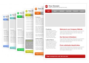
Even if you don’t use WordPress, you can still purchase web templates from TemplateMonster. They will give you a very drastic head start toward a completely designed website. All you really have to do is fill in the blanks by inserting your content into the design. Take a look at some of the web templates you can purchase here.

<< Back to Visual Design Forward to Stock Images and Graphics >>

Using Microsoft Tags on your business cards

Back in April, I wrote an article about using digital barcodes on your business cards, but today, Microsoft just took their service out of beta mode and I decided there was a lot more to be said on the subject, so here’s a new post just for Microsoft Tag.

First of all, if you haven’t seen my other article, go check it out now. Otherwise, here’s a small breakdown of what it was all about. I was talking about new ways to distribute information while still using an old standard: business cards. Generally, when you meet someone and/or acquire a new business contact, 9 times out of 10, they’ll hand you a business card.

Downsides of business cards

  • Cumbersome – I know what you’re thinking…how can these little cards be cumbersome? Well, lets say you go to a trade show and score about 100 of these little cards. Do you know what a stack of 100 business cards looks like?!
  • Stagnant – Once your card is printed, there’s no turning back. If your number changes, you have to reprint new cards. This may not be so much of an issue because cards are cheap, but what about all those people in the past that have taken your card? If you don’t have their contact info, you’re screwed.
  • Dime-a-dozen – This means that everyone has them and generally speaking, you don’t stick out very much. How can you hand a business card to someone and have them remember who you are?
  • Information overload – I’ve seen cards that have so much text on them and 5 different phone numbers that I don’t even know where to begin! Also, have you ever had to sit at your computer and input all that information by hand? How about for 100 cards? Yes, you could purchase a business card scanner, but it’s still a time consuming process.

What is a Microsoft Tag?

Microsoft has introduced a new barcode format that uses a multi-colored series of triangles to represent data. Essentially it works the same way as other data-enabled barcodes that can store all characters (instead of just numbers). You have most likely seen these barcodes on shipping boxes from FedEx or UPS.

Microsoft has set up a site specifically for those wishing to create their own tags at Tag.Microsoft.com. You can create any number of tags using these tag types:

  • URL – This tag type will only contain a URL to your website, so when someone scans it on a mobile device such as iPhone, they will automatically be sent to your website. (The tag to the right is a URL tag for this site. Try it!)
  • Free Text – This type allows you to simply create a tag that contains random text. You can use this type if you want to encode some kind of message for your visitors to see. An idea could be a special offer that you’re giving away. Allowing your customers to scan it will create interactivity.
  • vCard – This will probably be the type you’ll use most as it allows you to save all of your contact information in the vCard format. You can even import already existing vCards!
  • Dialer – The one works similar to the URL type, but instead, it just stores your phone number. Any smartphone that can automatically read phone numbers as such will start an automatic call to the number.

Always up-to-date

The most important item to mention is that once you create a new tag type, it’s already been encoded based on a unique registration number. What this means is that as long as you don’t delete the tag, you can always log into your Tag account and update, change or delete information and the tag image never changes!!

In theory, you can create a business card with nothing on it except your Microsoft Tag and your business card will never get outdated. You could even put a line of text on the card that says “Scan here for updated contact info”

How can I scan these?

All you need to do is get the mobile software for your phone! The easiest way to do this is grab your phone and go to this address: gettag.mobi

Of course, not every device is supported, but here’s a current list of supported operating systems and phones at the time of this writing:

  • Android
  • Blackberry
  • iPhone
  • J2ME (Beta)
  • Java 2 Micro Edition (Beta)
  • PalmOS
  • Symbian S60
  • Symbian S60 1st Edition
  • Symbian S60 2nd Edition
  • Symbian S60 3rd Edition
  • Symbian S60 5th Edition
  • Windows Mobile
  • Windows Phone

Final thoughts

This is the ultimate convergence of technology and a proven standard! I remember back with people thought the business card would be replaced by mini cdrom business cards, but imagine handing a disc to someone and then expecting them to have access to a computer at all times to be able to read the contents? This new technology doesn’t have to replace the old…it simply adds to it.

Another possible advantage is that in some cases, you’ll find that you don’t even have to give out your card! Just let someone scan it, get your information and give it right back to you. You don’t even have to put these tags on business cards. Put them on flyers, posters, email signatures, websites, message boards, etc. Here’s one I just thought of: use it as your avatar throughout the Internet!

In the end, what really matters is how you’re being remembered. Right now, not a lot of people are using this technology, so you have the opportunity to stand out above the crowd.

UPDATE: November 18th, 2010

I hadn’t been on the Microsoft site since creating my first tag, but when I decided to finally get my new business cards printed, I went back and discovered some great news. Microsoft now allows you to create tags in black and white! This was such a relief for me because I really didn’t like the fact that they were in color before. I mean no matter what your business cards look like, how will pastel colors ever fit in?!

Anyway, I created my first business cards that can be seen over on my article about putting barcodes on business cards and I think they really turned out well! Both the Microsoft tag and the QR barcode are fully readable by mobile scanners and work just as intended.

Earn Money and Build Your Reputation As A Freelance Writer

Building your blog takes time. In most cases it also takes actual writing skills and dedication to your craft to start pulling in traffic. In the meantime however, there are ways to get your content in front of viewers to use as a platform for promoting yourself and/or your website.

Think of it this way: imagine you had a website and you want to build your reputation rather fast. You come across a website that allows contributions from outside writers and you submit an article. This article is now accessible on an already existing website with a large traffic flow. When people read your article, they see your name (and profile). This information then leads to your own blog or website and instantly you become known in the blogosphere!

Ok, so maybe it’s not as easy as it sounds! But the point is, if you know your content is good and you want to get it in front of people relatively easy, this is one sure way to do it. Check out my Associated Content profile to see how people will view you.

AssociatedContent.com


AC is touted as “The people’s media company” and it is essentially a collection of over 2 million articles written on almost every topic you can think of. The best part is that these articles are written by people like you! That’s right. You are a contributor to a growing collection of content and at the same time, building a name for yourself.

To sign up, you simply need to head on over to the AssociatedContent signup page and fill out the required information. Afterward, you’ll be sent a verification email. Once verified, you’ll be taken into your account and you can start publishing content right away!

How does AssociatedContent work?

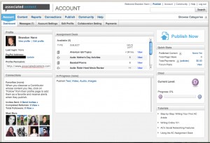
Once logged in, you’ll have access to your dashboard. It’ll look similar to this:

From here, you can do a number of different things like publish new content, check messages, edit your public profile and connect with other writers. Once you get going, this is generally how the site works:

  1. Pick the format you want (Text, Video, Audio, Images).
  2. Pick the topic that the content is about.
  3. Answer some copyright questions about how you want your work distributed.
  4. Choose a payment method.
  5. Publish your content!

Within your dashboard, you can also see a number of previously established assignments that you can choose to fulfill if you’d like. Don’t worry about writer’s block either! Associated Content will provide you with ideas if you’re stuck.

How much do I get paid?

The main payout option is Performance Payments. The rate is $1.50 per 1000 pageviews. This amount can be upped to $2.00 after certain requirements are met. This is the description of Performance Payments as outlined on the website:

Performance Payments are payments based on the traffic to your content and allow you to earn unlimited cash from your text, video, slideshow and audio submissions long after they have been published. You earn money for every one thousand page views your content generates (PPM™ rate). The baseline PPM™ rate is currently $1.50 – meaning if you generate 30,000 page views, you’re paid $45.00 in Performance Payments. As your library of content grows and your total page views accumulate, your Clout level increases. When you reach Clout 7 and beyond, your PPM™ rate will gradually increase up to a maximum of $2.00 per thousand page views. Check out the quick stats (under total payments) on your Account dashboard to see your current estimated earnings, and track your page view statistics per piece of content from the Content page. Click here to read more about the Clout system.

Another payout option is Upfront Payment. Your content is subjected to a review by the site editors and based on its originality and quality, you will receive an offer. At this point, you can choose to accept the offer or not. There are stricter rules for submitting this kind of content.

More Information

There is a LARGE amount of information you may want to peruse through before you get started, but if you’re interested in becoming a freelance writer and/or build your reputation along the way, you will love this site. For more information, please see AssociatedContent’s FAQ section.

To sign up now, go to AssociatedContent.com!

List Building – Landing Pages

I’m sure that you have seen quite a few landing pages throughout your Internet travels, but maybe didn’t know what they were called. Or maybe you did, but didn’t understand the importance of these pages.

What is a landing page?


Simply put, it’s a page you land on after clicking a link. This sounds easy enough, but deep down, every little detail you incorporate (or don’t) will affect the quality and performance of this page. So what are they for? When an advertiser is promoting a product or service, they will create a static page on the Internet somewhere that showcases this product or service and is essentially the make or break presentation.

They are commonly used by affiliate marketers as a means to send their visitors to the advertiser’s website to gain a referral bonus. Here’s an example of a successful landing page.

Why is a landing page important?

From an advertiser’s point of view, your landing page should be designed to sell. Unlike a face-to-face sales pitch where you can gauge things like emotion, customer response and even overcome objections, a webpage is a one-shot deal. If you customer lands here and loses interest, they leave the page and your sale is gone forever!

Just like creating effective advertisements like Google ads, banners, etc. you want to keep people interested and above all, you want to make them want your product when they’re done reading the page.

From a visitor’s point of view, your landing page should be straight forward. It should sell the product well and sell it fast. Pre-answer everyone’s questions up front and add just enough visuals to keep people interested.

How should I design this page?

The design should be non-intrusive, but visual enough to maintain interest. For content, some people will tell you that you shouldn’t use a targeted landing page (see below) to promote or discuss anything other than what product your selling. Others might tell you to use landing pages as opportunities to upsell other things you might be offering.

Types of landing pages:

  • Targeted – These pages may be part of your website, but they look nothing like your site because they are only there to promote one item. The entire page is written only for this item and does not contain any other links, pictures or “plugs”.
  • Dynamic – This type of page can be mixed with other types. Essentially a dynamic page, much like any dynamic webpage, will allow you to create custom content based on a referring site or affiliate link. An example would be in the landing page made references to the site you came from, so it appears as though that site heavily endorses this product.
  • Static – This is your average landing page and it can be a page build specifically for a product, or it can simply be a static page located within your site that helps promote the product. Using this type of page may detract a little form your intending purpose, but it could open doors for promotion of the rest of your business.

My suggestion is to go with a page that only focuses on one thing. The reason for this is that you’ll be advertising this page through a PPC network and the traffic generated from these networks is very targeted toward a particular niche. So if you landing page was selling auto-blogging software, you would only be targeting web traffic that was looking for auto-blogging software and therefore you would not want to fill this page with information on other software you’re selling.

Getting started

The first thing you want to do is gather your ideas. Think about what you want to accomplish with your page, who you’re advertising to, how they are able to buy your product and what would make them interested. Once you have these basics down, you should have a clear understanding of how to setup your page.

Just keep in mind that the goal of landing pages is to convert sales quickly. The people that will be clicking through are not there to see your site. They were advised by someone else to click on that link and you need to be there to present them with a valid reason for staying.

Increase effectiveness

Here are some tips on how to increase the overall effectiveness of your landing pages:

  1. Create concise text without being too short. Find that perfect balance so you’re not overdoing or underdoing it.
  2. Add a FAQ to try and answer questions you might already know will probably be asked by your visitors. This way, they don’t need to take time to find out how to contact you.
  3. Keep the content search engine friendly and make sure you’re not using duplicate content on multiple landing pages.
  4. Make sure the page loads fast. Nobody is going to wait for your page to load if it takes longer than 5 seconds.
  5. Consider adding a video clip of the product in use or you explaining your service. Even a video of you reading the same content that’s already on the page will be highly effective.
  6. Add some social media links to increase your exposure. Use sites like Twitter and Facebook so people can readily find you if they’re really interested in what you offer.
  7. If you have a few customer praises about your products, put them on there to let people know what others think of you.

Testing your landing pages

In researching this topic, I found a great site that talked about testing landing pages. Originally I wasn’t even going to mention it because it’s one of those things that webmasters usually do naturally by reviewing page stats and click-through ratios, but this site brought up a really good point.

Michael Bloch from TamingTheBeast.net mentioned that to test a landing page, you should send 5 of your friends to the page without telling them what the page is about and have them look it over for about 5 seconds. When they’re done, instead of asking them “Does it look good?”, ask them what they remembered about the page. Don’t get too specific with the question. Just have them spit out key things that they remembered.

If they can’t even tell you what you were selling or what the page was about, then something is very wrong! Their input might be able to help you pinpoint areas of the page that need improvement.

Further testing is easily done with the web statistics I mentioned, but don’t just look at counters. Look at how long your visitors are staying on the page. If you read your own page from top to bottom, how long did it take you? Are your visitors staying for at least that long?

Further reading

This post was just to touch some key points on landing pages and is in no way intended to be 100% thorough! There are countless possibilities to creating, promoting and using landing pages and your results will vary greatly based on your industry and web skills.

<< Back to Whitelisting Forward To Reviews >>