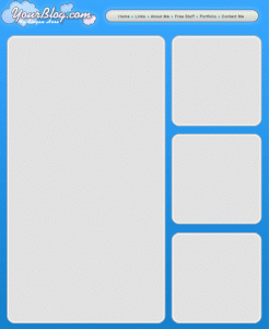
 A crucial design element of your website is the layout. Believe it or not, there are phycological studies on the layouts of other media such as magazines and newspapers. Small, but important details including where certain text is, how big the titles of pages are and what colors are used are all attributed to the success or failure of a website.
The best way to get ideas for your own site’s layout is to look at other related websites that contain similar content and see what it is that you like and don’t like about it. What I do is look at a site for a few minutes, close my eyes and then try to remember the things that stood out.
Choosing the right layout
As you scour around the Internet, you may notice design patterns spanned over the various websites you see. You might have noticed that most news sites tend to favor white backgrounds with black text. You’ll notice media sites like YouTube and Hulu that design the rest of the site around their video players.
The point of any layout is to draw attention to a specific area of a page to generate the most focus on that spot. This will ensure that if you’re blogging, your content is being read or if you’re showing videos, that your videos are being watched.
Just take a look at my site. You can see how things are organized within a matter of seconds. Every page conforms to the same layout in general and this was done to keep everything looking clean as well as to allow the content to flow. When you create your own site, you want to make sure that the design flows and matches, but not to mix everything together. This can confuse your visitors and will probably make them leave your site.
Themes and templates
Both of these are generally the same. The difference is how they’re applied. A template is a set of pre-built files that make up a website that allows you to fill in or change information to correspond to your own needs. A theme does the same purpose, but it’s applied to a pre-built structure. The main difference between themes and templates is that you can change the theme of an entire website without affecting too much of the content. A template needs to be re-edited if it’s changed.
If you’re running a blog site, using is theme is the only way to go. This is because WordPress is a full software package all rolled into one that allows you to apply different color and layout themes as needed.
Here are a couple of place to look for great themes and templates:
- TemplateMonster – This site has thousands and thousands of web templates and they even have themes for content management systems like WordPress, Drupal and Joomla. Their prices range from about $20 to $150.
- WooThemes – WooThemes makes themes specifically for WordPress, ExpressionImage, Drupal and Tumblr. They have some free themes, but the paid ones seem to be of much higher quality and generally have more features.
- StudioPress – If you want to up the ante (and the price) on quality WordPress themes, you need to go here! In fact, if you want to see a sample of one of the themes they offer, you can look at my other website.
| << Back to Stock and Graphics | Forward to White Space >> |


