I’m sure that you have seen quite a few landing pages throughout your Internet travels, but maybe didn’t know what they were called. Or maybe you did, but didn’t understand the importance of these pages.
What is a landing page?

Simply put, it’s a page you land on after clicking a link. This sounds easy enough, but deep down, every little detail you incorporate (or don’t) will affect the quality and performance of this page. So what are they for? When an advertiser is promoting a product or service, they will create a static page on the Internet somewhere that showcases this product or service and is essentially the make or break presentation.
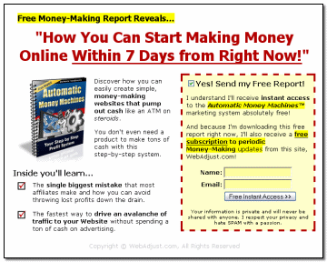
They are commonly used by affiliate marketers as a means to send their visitors to the advertiser’s website to gain a referral bonus. Here’s an example of a successful landing page.
Why is a landing page important?
From an advertiser’s point of view, your landing page should be designed to sell. Unlike a face-to-face sales pitch where you can gauge things like emotion, customer response and even overcome objections, a webpage is a one-shot deal. If you customer lands here and loses interest, they leave the page and your sale is gone forever!
Just like creating effective advertisements like Google ads, banners, etc. you want to keep people interested and above all, you want to make them want your product when they’re done reading the page.
From a visitor’s point of view, your landing page should be straight forward. It should sell the product well and sell it fast. Pre-answer everyone’s questions up front and add just enough visuals to keep people interested.
How should I design this page?
The design should be non-intrusive, but visual enough to maintain interest. For content, some people will tell you that you shouldn’t use a targeted landing page (see below) to promote or discuss anything other than what product your selling. Others might tell you to use landing pages as opportunities to upsell other things you might be offering.
Types of landing pages:
- Targeted – These pages may be part of your website, but they look nothing like your site because they are only there to promote one item. The entire page is written only for this item and does not contain any other links, pictures or “plugs”.
- Dynamic – This type of page can be mixed with other types. Essentially a dynamic page, much like any dynamic webpage, will allow you to create custom content based on a referring site or affiliate link. An example would be in the landing page made references to the site you came from, so it appears as though that site heavily endorses this product.
- Static – This is your average landing page and it can be a page build specifically for a product, or it can simply be a static page located within your site that helps promote the product. Using this type of page may detract a little form your intending purpose, but it could open doors for promotion of the rest of your business.
My suggestion is to go with a page that only focuses on one thing. The reason for this is that you’ll be advertising this page through a PPC network and the traffic generated from these networks is very targeted toward a particular niche. So if you landing page was selling auto-blogging software, you would only be targeting web traffic that was looking for auto-blogging software and therefore you would not want to fill this page with information on other software you’re selling.
Getting started
The first thing you want to do is gather your ideas. Think about what you want to accomplish with your page, who you’re advertising to, how they are able to buy your product and what would make them interested. Once you have these basics down, you should have a clear understanding of how to setup your page.
Just keep in mind that the goal of landing pages is to convert sales quickly. The people that will be clicking through are not there to see your site. They were advised by someone else to click on that link and you need to be there to present them with a valid reason for staying.
Increase effectiveness
Here are some tips on how to increase the overall effectiveness of your landing pages:
- Create concise text without being too short. Find that perfect balance so you’re not overdoing or underdoing it.
- Add a FAQ to try and answer questions you might already know will probably be asked by your visitors. This way, they don’t need to take time to find out how to contact you.
- Keep the content search engine friendly and make sure you’re not using duplicate content on multiple landing pages.
- Make sure the page loads fast. Nobody is going to wait for your page to load if it takes longer than 5 seconds.
- Consider adding a video clip of the product in use or you explaining your service. Even a video of you reading the same content that’s already on the page will be highly effective.
- Add some social media links to increase your exposure. Use sites like Twitter and Facebook so people can readily find you if they’re really interested in what you offer.
- If you have a few customer praises about your products, put them on there to let people know what others think of you.
Testing your landing pages
In researching this topic, I found a great site that talked about testing landing pages. Originally I wasn’t even going to mention it because it’s one of those things that webmasters usually do naturally by reviewing page stats and click-through ratios, but this site brought up a really good point.
Michael Bloch from TamingTheBeast.net mentioned that to test a landing page, you should send 5 of your friends to the page without telling them what the page is about and have them look it over for about 5 seconds. When they’re done, instead of asking them “Does it look good?”, ask them what they remembered about the page. Don’t get too specific with the question. Just have them spit out key things that they remembered.
If they can’t even tell you what you were selling or what the page was about, then something is very wrong! Their input might be able to help you pinpoint areas of the page that need improvement.
Further testing is easily done with the web statistics I mentioned, but don’t just look at counters. Look at how long your visitors are staying on the page. If you read your own page from top to bottom, how long did it take you? Are your visitors staying for at least that long?
Further reading
This post was just to touch some key points on landing pages and is in no way intended to be 100% thorough! There are countless possibilities to creating, promoting and using landing pages and your results will vary greatly based on your industry and web skills.

