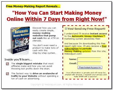
Internet marketing is competitive and you need to be on the cutting edge of the competition if you want to stay afloat. A squeeze page is just one more way to extract (or squeeze) business out of your website. Think of it like squeezing the last drops of juice out of a lemon. Since every visitor on your site counts, it’s important to find ways to get them on your mailing list without running them off.
What is a squeeze page?

You may find various definitions about what a squeeze page actually is and some might even consider a squeeze page the same as a landing page and they are right for the most part–they are very similar.
I make the distinction between the two by reserving landing pages specifically for the advertising of a certain product and a squeeze page for simply the advertising of your site and mailing list as a whole. The main difference would be that one page is very targeted and one is not.
How do I make them effective?
Testing, testing and more testing. That’s the short answer! Nobody can answer this question for you because every website is different than the next. Your visitors might have very different needs than those that come to my site and only you would know what it is they need. The good news is that I have some general tips on how to make a squeeze page! Take these tips and mix them with your own style of branding and you’ll have the advantage.
- Optin form – This is the most important part! If your users don’t have anywhere to signup, it’s pointless to have. Make this form easily found and clearly marked. Don’t hide or dress it up too much otherwise, you’ll lose potential signups.
- Benefits – This is where you tell your visitors what they get out of the deal. Remember, the whole point is to get subscribers to your site so offer them something they will be interested in based off the content that your site is about.
- Header graphics – Ensure that you have an attractive header graphic. Consider the squeeze page somewhat of an advertisement, so this graphic should draw people in. Keep it simple, but effective.
- Headline text – Provide captivating headline text to help with the graphical “sales pitch” of your newsletter. Once again, the idea is to draw interest to your ad, but most of all, maintain that interest long enough to produce a sign up.
- Sample product – If you can, provide a sample of the product such as a lengthly product description or a video of your product in action.
More info
As I stated in the beginning, the success of your squeeze page will depend heavily on your audience and you need to know who you’re promoting to in order to increase signup frequency. As an example, if you run a blog about gardening, it’s probable that your users aren’t going to like (or care for) large, colorful, in-your-face graphics and crazy sounds or music, so tone it down.
Beyond that, I hope you got the basics down! Have fun with it!
| << Back to Reviews | Forward To Newsletter >> |
One thought on “List Building – Squeeze Page”