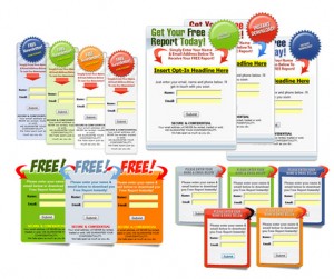
Oh, the infamous opt in! This is the gateway to your profitable mailing list. Don’t abuse it or underestimate it; otherwise you might be in for a rude awakening. If done right, you’ll get a nice group of loyal and dedicated readers of your material and offerings. If done wrong, you can say goodbye to all the extra income you were hoping for.
The key to the opt in form is to make it accessible, but not to make it obnoxious. Feel free to promote it wherever  you get the chance, but don’t force it in your visitors’ faces. You may have seen websites that throw out popup or popunder windows and you already know how annoying these are.
Proper opt in techniques
- Static page – Create a static page that talks about your newsletter or marketing materials and clearly outline what it is someone will be getting if they sign up at your site. Link to this page from your home page as well as anywhere else you talk about your newsletter.
- WordPress widget – There are many plugins and themes that offer you the option of placing custom HTML code in your sidebar, header or footer. Create an instant webform that asks for their name and email address so they only have to click submit to sign up.
- Email signature – Start promoting your newsletter to everyone you email! This the best anti-spam way of letting people know what you have going on. I don’t know about you, but I always look at people’s signatures.
No matter how you promote your opt in form, the most important thing to remember is that you don’t want to spam it, force it or oversell it, which brings me to my next list!
Improper opt in techniques
- Popup windows – Back in the old days, a popup window was used as a useful way to show someone information without having to change pages or open a whole new browser window. Today, they are the most annoying form of advertising and your opt in form should never appear on one. Besides the high probability of being blocked anyway, you’re likely to lose people just because your site looks tacky.
- Popunder windows – A popunder window carries the same annoyances as its popup counterpart, but this one is designed to show up behind the window you have open. This way, when you’re done surfing and you start closing your browser windows, this mysterious window will be left open. While it does have some potential for catching people off-guard, it too can make your site look tacky.
- Forced – Forcing someone to signup to your list just makes you look desperate. One way this can be done is when someone emails you to ask a question and you immediately add them to your mailing list just because you now have their email address. Remember that just because they sent you a message does not mean they want more emails from you.
- Spam – It should go without saying, but obviously you don’t want to spam your visitors to get your newsletter. Not only does this look bad, but it’s illegal and your visitors are likely to get the idea that all of your future communications will be spam-like.
Building a list is not easy and it takes a lot of work to get it right. I’m still amazed at the amount of people that visit my site each day compared to the amount that sign up for my newsletter! However, having patience and doing it right will create a better experience for you and your visitors.
| << Back to Spam Scoring | Forward to Demographic Info >> |
One thought on “List Building – Opt In Capture”