Visual Design – CDN

CDN stands for Content Delivery Network. Its sole purpose is to help you evenly spread your entire website’s content (mostly the larger media files) across multiple web servers to alleviate server load from a single machine. This, in turn serves two purposes.

First, it minimizes how much bandwidth you’re serving out to your web visitors on your webhost. Second, it allows your site to run smoothly without server crashes, timeouts and user caps. However, a CDN can be quite expensive depending on what type of CDN you require and what services you need. Let’s explore these.

CDN Types

A Content Delivery Network can serve the function of completely mirroring a portion of your site or a specific area of your site, like your video section or streaming music channel. Back in the old days, we didn’t have sites like YouTube, so if you wanted to play videos on your site, you needed a lot of bandwidth or pay a company to host the video for you and stream it live from your site.

  • End-to-end Transport – This is the fundamental standard of the Internet. It basically means the service will connect you to the content directly. Let’s say you had 10 videos all about 5 minutes each. Just for the sake of this point, let’s assume to stream each video, it would “cost” you about 100mb in bandwidth. If your site streamed all 10 videos 10 times a day, that’s 10GBs of bandwidth every day! To offset this cost, a CDN would charge you a monthly fee to host the video thus sparing your server–and your wallet.
  • P2P Transport – I can write a whole article on just P2P alone! To keep this one short, P2P is short for peer-to-peer and it is currently used as the backbone for downloading content online. The idea behind it is sharing. For example, when you are downloading (and watching) a video, you are also helping in the upload process for someone else who is watching it too. So rather than 1000 people streaming 1 video from 1 site, each of these thousand are sharing the parts they downloaded with the other users who need them. This allows the 1 video to circulate through all viewers at the same time thus removing the main load from the website.

CDNs aren’t generally described as P2P networks as they were designed to use point-to-point protocol, however P2P has become a fast alternative and popular protocol among the large media sites of today. Some examples of CDNs (and P2P) are bit torrent, Internet radio, Hulu, YouTube, Webcasting and Internet tv.

Content Providers

High-end delivery companies are designed to handle massive amounts of web users, traffic and media data every single day. If you’re running a basic website or blog, you will never need something of this nature, but nonetheless, here are a few commercial companies.

How does all this help me?

Again, depending on your specific needs, you may or may not even need a CDN. The point is that if you have a very large web presence, you might want to consider saving some of your webserver’s bandwidth and going with a company that specializes in these services. Doing so can dramatically decrease your monthly costs and save you a lot of headaches over time.

<< Back to Bandwidth Consideration Forward to Interlaced Images >>

Visual Design – Color Pallets

As equally important as whitespace is the choice of colors throughout your site. These colors can represent your company’s existing logo properties, a particular color scheme used throughout the products you sell or simply just a series of colors that are pleasing to the eye.

If you’re just starting out a business, choosing the color scheme is much easier because you can essentially start from scratch. You may even begin by choosing the desired website design and then using it as a starting ground for your branding.

What colors do you use?

Surprisingly, not a lot of thought goes into this question for most web designers. The problem is that most people simply start with a cut and paste approach to website design and copy elements off a template. For example, lets say you downloaded a fresh new template that was all black and red. You got it because you liked it and it was cool. Rather than come up with your own color scheme or layout options, you forced yourself to use the ones in the template.

Now this isn’t such a bad idea if you just want to whip a fast site together, but if you’re in it for the long haul, you are missing out on future opportunities to market and brand your site better.

Think about a big name company’s image. Is their logo one of those logos that you can take a half-second glance at and still know what it was you saw? You have to remember that when you’re starting a business, your choice of colors and theming is the most important thing for your image and/or brand.

How do colors benefit readers?

Besides the overall look and feel of your site, your visitors are going to benefit greatly from your choice of layout. That’s because colors play a large role in visual response. Ever wonder why most of your local big-chain restaurants use the color red in their logos and marketing materials? This is because some scientist did a study a while back and determined that the color red is closely associated with the feeling of hunger and generally speaking, a red sign pointing out a flashy restaurant is supposed to make you more hungry.

The same can go for your website. The proper use of white space, the choice of colors and even the style of font and logo design can all keep your users browsing or drive them away. Of course, a lot of web users don’t care what your site looks like as long as you have the information they were looking for, but as you get more and more into the Internet, you deal with more and more competition. This means that any edge you can obtain is something worth considering.

My two cents

This post was more of an eye-opener rather than actual help, but that’s because nobody can tell you how to design your site. Only you (and others with similar sites) can know what your visitors like or don’t like. If you really want to find out, look at other sites in your field or start polling your own visitors to see what they think.

<< Back to White Space Forward to Image Slicing >>

Visual Design – White Space

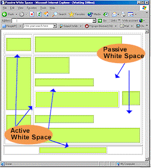
White space is the most literal concept you’ll find in this section. It is the actual space between design elements such as paragraphs, images, text, graphs, etc. The purpose of this space can vary depending on your desired results. One reason for using it might be to create a specific flow to your design. You may want to direct one’s eyes to something on a page more so than other items.

By the way, WebDesignNuts.com created a great article about how to use white space effectively, but to summarize, I’ve written a little piece myself.

Effective use of white space

The most common use of white space can be found in just about every publication on Earth including almost every website you’ve been to. What I’m referring to is the breakup of large blocks of text into smaller chunks that can be more easily digested. The following text is NOT effective use of whitespace:

We are guessing that most of you have already read Gizmodo’s account of how they managed to obtain a prototype for the upcoming Apple iPhone 4G device. If you have, then you’ll know that the whole thing was allegedly down to a 27 year old Apple Software Engineer, named as Gray Powell, who managed to leave the prototype in a bar in Redwood City, Calif. Now that the whole thing has come out, and Apple are yet to confirm or deny the story – what will the repercussions be for Mr Powell? Every human makes a mistake once in a while, but you have to say that this is a major blunder if it turns out to be true. Will Apple remove Powell from further duty, or will common sense prevail and no firm action will be taken? Hopefully it will be the latter, but you never know with Apple. Let us know your opinions on the whole saga and what YOU think should happen to Gray Powell.

-Text quoted from Product-Reviews.net

The text above looks much better if formatted properly:

We are guessing that most of you have already read Gizmodo’s account of how they managed to obtain a prototype for the upcoming Apple iPhone 4G device.

If you have, then you’ll know that the whole thing was allegedly down to a 27 year old Apple Software Engineer, named as Gray Powell, who managed to leave the prototype in a bar in Redwood City, Calif.

Now that the whole thing has come out, and Apple are yet to confirm or deny the story – what will the repercussions be for Mr Powell?

Every human makes a mistake once in a while, but you have to say that this is a major blunder if it turns out to be true. Will Apple remove Powell from further duty, or will common sense prevail and no firm action will be taken?

Hopefully it will be the latter, but you never know with Apple. Let us know your opinions on the whole saga and what YOU think should happen to Gray Powell.

-Text quoted from Product-Reviews.net

Now imagine if an entire website appeared like the first block of text! Just looking it would make you want to change the page. To make effective use of white space, you need to focus on things other than breaking paragraphs apart. Here are some things to consider:

  • Line spacing – In college, you generally had to make all your papers double-spaced, but on websites you can space as much as you like, even down to the last pixel.
  • Margins – Keep side bars and advertisements at bay so they don’t crowd your page too much. In general, you don’t want to flood your site with stuff like that anyway, but more importantly, you want to keep it away from your content. After all, you visitors don’t come to your site to look at ads.
  • Headings – Make sure your headings stand out and properly define the content below them. This isn’t just good practice for design, but also search engine rankings as well.
  • Images – How often have you been to a site where the images seem to be mixed right in over or under the text? Your images should standout alone and text should either wrap around them or stay on one side.

More information

This was just a sampling of what to look for when designing your pages. I’d suggest doing a deep search if you think you’re having problems adjusting content on your pages. If all else fails, get yourself a web template or theme that controls the layout for you.

<< Back to Layout Forward to Color Pallets >>

Visual Design – Layout

A crucial design element of your website is the layout. Believe it or not, there are phycological studies on the layouts of other media such as magazines and newspapers. Small, but important details including where certain text is, how big the titles of pages are and what colors are used are all attributed to the success or failure of a website.

The best way to get ideas for your own site’s layout is to look at other related websites that contain similar content and see what it is that you like and don’t like about it. What I do is look at a site for a few minutes, close my eyes and then try to remember the things that stood out.

Choosing the right layout

As you scour around the Internet, you may notice design patterns spanned over the various websites you see. You might have noticed that most news sites tend to favor white backgrounds with black text. You’ll notice media sites like YouTube and Hulu that design the rest of the site around their video players.

The point of any layout is to draw attention to a specific area of a page to generate the most focus on that spot. This will ensure that if you’re blogging, your content is being read or if you’re showing videos, that your videos are being watched.

Just take a look at my site. You can see how things are organized within a matter of seconds. Every page conforms to the same layout in general and this was done to keep everything looking clean as well as to allow the content to flow. When you create your own site, you want to make sure that the design flows and matches, but not to mix everything together. This can confuse your visitors and will probably make them leave your site.

Themes and templates

Both of these are generally the same. The difference is how they’re applied. A template is a set of pre-built files that make up a website that allows you to fill in or change information to correspond to your own needs. A theme does the same purpose, but it’s applied to a pre-built structure. The main difference between themes and templates is that you can change the theme of an entire website without affecting too much of the content. A template needs to be re-edited if it’s changed.

If you’re running a blog site, using is theme is the only way to go. This is because WordPress is a full software package all rolled into one that allows you to apply different color and layout themes as needed.

Here are a couple of place to look for great themes and templates:

  • TemplateMonster – This site has thousands and thousands of web templates and they even have themes for content management systems like WordPress, Drupal and Joomla. Their prices range from about $20 to $150.
  • WooThemes – WooThemes makes themes specifically for WordPress, ExpressionImage, Drupal and Tumblr. They have some free themes, but the paid ones seem to be of much higher quality and generally have more features.
  • StudioPress – If you want to up the ante (and the price) on quality WordPress themes, you need to go here! In fact, if you want to see a sample of one of the themes they offer, you can look at my other website.
<< Back to Stock and Graphics Forward to White Space >>

Visual Design – Stock Images and Graphics

Naturally you need images to help add to the design of your website and in the case of managing a blog site, you also need them to help sell your point. There are millions of images all over the Internet, but the problem is that you have to contend with copyright laws and trademark issues.

So what’s the answer to this dilemma? Basically you have three choices. One, create all the images yourself. Two, find royalty-free images to use. Or three, consider purchasing/using stock images and graphics.

What are stock images and graphics?

Stock images are usually a generic image of something that you use to sell a product or add dimension to a piece of writing. You might have seen on eBay for example an item listed and a caption underneath stating stock photo. This just means that the picture you’re looking at is not of the actual item for sale, but it is an image of the item.

Stock photos are also used for magazine, newspaper and blog articles. I picked up the image above right off of one of the sites below and added it here to create some color for this post.

There are companies out there that specialize in the distribution of images and graphics that were created by various people for the express purpose of using in specific applications. Some stock images are free, most you have to pay for. Sometimes, you must also take into consideration the format in which they are allowed to be used.

Where do I get these images?

There are plenty of places online offering stock photography and a quick web search will do the trick, but here are a few of the ones I find to have the best quality images

  • Stock.Xchng – This site is considered to be the leading stock image site for FREE images, so you may want to make this your first stop before paying for photos elsewhere.
  • Getty Images – If you want to search through over 24 million photos, this is the only place you can do so. You have probably seen many, many photos in magazines, web articles and more that have a photo credit to Getty Images. Well, now you can get access to these same images!
  • BigStock – The thing I like about this site is that you buy credits to use for purchasing images and not every image is the same credit price. Plus, the more credits you buy up front, the more you save.
  • Shutter Stock – Here’s a great royalty-free collection of images that I just recently came across, but it seems to have a lot to choose from.

My two cents

Use photos as often as needed, but don’t overdo it! You don’t want to crowd your page design with images and graphics that don’t apply to your content. Last but not least, never use copyrighted images without permission! People like me, who create original content, do not appreciate it when people simply take our creations for their own advancement. Speaking of which, you might want to check out my copyright information to see how I allow my site to be used!

<< Back to Software Forward to Layout >>

Visual Design – Software

There is a plethora of web design software out there! It’s no joke. And nobody knows where to start! In fact, web design is such a special niche, that people are turning to hiring designers to take care of all the loose ends. The problem with this is that the costs can go through the roof. Worse yet, what do you do when you want to make a design change? You have to rely on someone else to do it for you.

The catch 22 is that you either spend time building the site yourself to save money, but then you don’t have enough time to focus on your business or you pay someone to do it to save time, but then you don’t have enough money to spend on developing your business!

Top Web Design Software

There are a couple of choices in the type of software you get. The main type is called a WYSIWYG editor (what you see is what you get). Think of this as a blank piece of paper and you have to write the code in manually. The other type is a live editor where you’re able to literally drag and drop text and images right on the design that you see. Think of it like looking at a colorful webpage and being able to move things around on the fly.

  • Adobe Dreamweaver – This is by far the best web design software there is, at least in my opinion. This is a hybrid editor that supports both direct coding as well as live design. Another advantage is that you can create and edit CSS styles directly in the software. Plus, if you have other Adobe programs, you can cross link documents between them. Read more about what Dreamweaver can do at Adobe’s website.
  • AceHTML Pro – This was the software I started with when I first began creating websites so many years ago! I still like it as a lightweight editor although I don’t use it anymore because I use Dreamweaver.
  • WebPlus Website Maker – I’ve never used this software so here’s the product description from the manufacturer:

    WebPlus X2 is Serif’s outstanding Vista certified web design solution, packed with everything an organization needs to design fully-featured and professional-looking sites–with no need to learn or program any HTML! With smart Web gadgets including forums and site search hosted for free by Serif, integrated e-commerce with partners including PayPal, support for engaging YouTube, podcast and RSS content, plus video and Shockwave Flash animations, WebPlus X2 is the perfect answer for in-house web design. WebPlus helps at every stage, whether starting with a professional business template, designing from scratch, automatically fixing design issues, or publishing to the Web, it’s never been easier to achieve fantastic results, fast.

  • WebEasy Professional – I’ve never used this software so here’s the product description from the manufacturer:

    Create a great website has never been easier. WebEasy includes everything you need in a one box to create your ideal website with built-in templates and e-commerce tools. Drag-and-drop simplicity and automatically HTML code generation, create the website you want without any programming or technical skills required.

Using Themes or Templates

With blogging taking over the Internet space as the next major form of design, software packages such as WordPress have paved the way for users to focus more on their content instead of the design. WordPress allows you to use pre-designed themes that can be installed with one click.

There are even sites such as StudioPress, Woothemes and TemplateMonster that sell WordPress themes so you can get a head start on a more advanced design than you can download for free. In fact, the very design you see on this site is from a web template!

Even if you don’t use WordPress, you can still purchase web templates from TemplateMonster. They will give you a very drastic head start toward a completely designed website. All you really have to do is fill in the blanks by inserting your content into the design. Take a look at some of the web templates you can purchase here.

<< Back to Visual Design Forward to Stock Images and Graphics >>