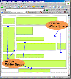
White space is the most literal concept you’ll find in this section. It is the actual space between design elements such as paragraphs, images, text, graphs, etc. The purpose of this space can vary depending on your desired results. One reason for using it might be to create a specific flow to your design. You may want to direct one’s eyes to something on a page more so than other items.
By the way, WebDesignNuts.com created a great article about  how to use white space effectively, but to summarize, I’ve written a little piece myself.
Effective use of white space
The most common use of white space can be found in just about every publication on Earth including almost every website you’ve been to. What I’m referring to is the breakup of large blocks of text into smaller chunks that can be more easily digested. The following text is NOT effective use of whitespace:
We are guessing that most of you have already read Gizmodo’s account of how they managed to obtain a prototype for the upcoming Apple iPhone 4G device. If you have, then you’ll know that the whole thing was allegedly down to a 27 year old Apple Software Engineer, named as Gray Powell, who managed to leave the prototype in a bar in Redwood City, Calif. Now that the whole thing has come out, and Apple are yet to confirm or deny the story – what will the repercussions be for Mr Powell? Every human makes a mistake once in a while, but you have to say that this is a major blunder if it turns out to be true. Will Apple remove Powell from further duty, or will common sense prevail and no firm action will be taken? Hopefully it will be the latter, but you never know with Apple. Let us know your opinions on the whole saga and what YOU think should happen to Gray Powell.
-Text quoted from Product-Reviews.net
The text above looks much better if formatted properly:
We are guessing that most of you have already read Gizmodo’s account of how they managed to obtain a prototype for the upcoming Apple iPhone 4G device.
If you have, then you’ll know that the whole thing was allegedly down to a 27 year old Apple Software Engineer, named as Gray Powell, who managed to leave the prototype in a bar in Redwood City, Calif.
Now that the whole thing has come out, and Apple are yet to confirm or deny the story – what will the repercussions be for Mr Powell?
Every human makes a mistake once in a while, but you have to say that this is a major blunder if it turns out to be true. Will Apple remove Powell from further duty, or will common sense prevail and no firm action will be taken?
Hopefully it will be the latter, but you never know with Apple. Let us know your opinions on the whole saga and what YOU think should happen to Gray Powell.
-Text quoted from Product-Reviews.net
Now imagine if an entire website appeared like the first block of text! Just looking it would make you want to change the page. To make effective use of white space, you need to focus on things other than breaking paragraphs apart. Here are some things to consider:
- Line spacing – In college, you generally had to make all your papers double-spaced, but on websites you can space as much as you like, even down to the last pixel.
- Margins – Keep side bars and advertisements at bay so they don’t crowd your page too much. In general, you don’t want to flood your site with stuff like that anyway, but more importantly, you want to keep it away from your content. After all, you visitors don’t come to your site to look at ads.
- Headings – Make sure your headings stand out and properly define the content below them. This isn’t just good practice for design, but also search engine rankings as well.
- Images – How often have you been to a site where the images seem to be mixed right in over or under the text? Your images should standout alone and text should either wrap around them or stay on one side.
More information
This was just a sampling of what to look for when designing your pages. I’d suggest doing a deep search if you think you’re having problems adjusting content on your pages. If all else fails, get yourself a web template or theme that controls the layout for you.
| << Back to Layout | Forward to Color Pallets >> |